Sunday, December 2, 2012

Lab 8 (Final): Station Fire

        The 2009 Station Fire in Los Angeles County was, to date, one of the most notable wildfires to occur in California. According to Inciweb.org, the Station Fire was caused by arson in the Los Angeles River Ranger District of Angeles National Forest. The blaze threatened several structures in the national forest, as well as many communities such as La Canada Flintridge, Glendale, La Crescenta, Altadena, and more. Beginning in the end of August, the Station Fire was not fully contained until mid-September. As a result, the fire burned about 160,577 acres and cost over $93 million to fight and contain. 

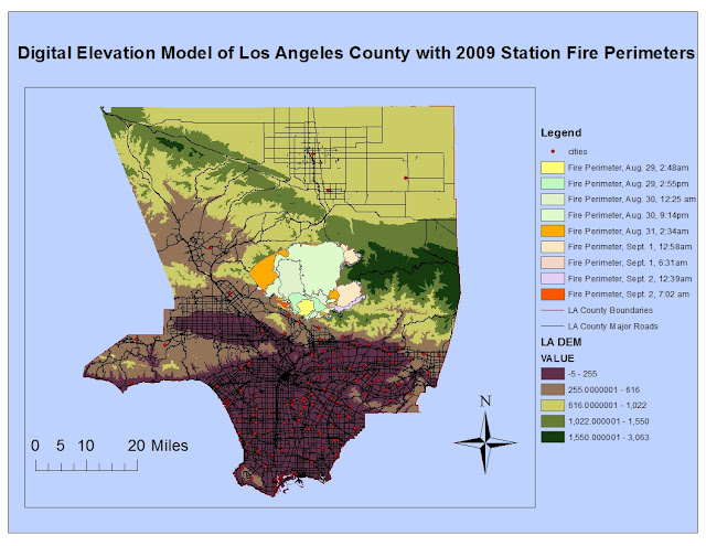
        The reference map above displays the evolution of the Station Fire's perimeters as it grew and ran its course within Los Angeles County, with data retrieved from Los Angeles County Enterprise GIS. The perimeters on the map were recorded during various times between August 29, 2009 through September 2, 2009. The blaze spread rapidly, as you can see by comparing the tiny yellow starting perimeter to the huge orange perimeter just two days later.Also included in the map is a digital model of the elevation of Los Angeles County, which when combined with the knowledge of the Station Fire's perimeter, indicates that the fire happened in higher elevation among the national forest. Also on the reference map are some of the major roads and cities within L.A. county. Thus, you can see that the Station Fire became a big threat to some populated cities near the fire perimeters and also may have caused damage to major roads/highways of L.A. which could have caused more of an adverse effect on traffic and transportation. 


        The thematic map above intends to show the proximity of the 2009 Station Fire to schools in Los Angeles County. It also includes information/data from the California Department of Forestry and Fire Protection, which is the fire threat among all locations in California. This map focuses on the fire threat throughout Los Angeles County.  I wondered how a huge fire like this could affect the school system, its schedule, and its students. I hypothesized that it would possibly close down some schools to put the kids out of danger. Also, I chose to include the fire threat component to show which schools had a higher probability of being affected by wildfires in the first place.

        From the map, you can see that the Station Fire, indeed, occurred in an area where the fire threat is extremely high. It also progressed in relatively the same area of high elevation and high fire threat. Fortunately, there are virtually no schools located in that same high fire threat zone where the Station Fire occurred. Thus, fire threat must be a factor in placing and location schools, to ensure the safety of the students and the school itself. Most of the Los Angeles County schools are located and clustered at a lower elevation in the more metropolitan areas so many weren't directly threatened by the flames. However, there were some schools that were located in medium-fire threat zones that were very close in proximity to the perimeters of the Station Fire, as indicated by the clusters of green dots that border the south of the fire perimeters. According to reports by the Los Angeles Times, schools delayed their start of the new school year due to the fire, remaining closed to students so they would be out of harm's way. Those schools were ones in the La Canada Unified, Glendale Unified, and Acton-Agua Dulce Unified Districts (which are represented by those green dots along the border of the fire perimeters). Others in places like the Pasadena Unified, Los Angeles Unified, and Saugus Union altered and limited outdoor activities/sports practices and more. Of course, the schools took these measures to protect the health of its young students. As the Center for Disease Control and Prevention (CDC) has stated, children are more likely to feel the adverse effects and threats from smoke because their airways are still developing and they breathe more air per pound of body weight than adults.

        In conclusion, measures were taken to protect the vulnerability of children and their health in schools that were close to the location of the Station Fire, like I predicted. Schools with the highest fire threat were the ones closest to the actual Station Fire, and closed down to put students out of harm's way. However, I did find some information that surprised me.  According to a report from ABC news, some high schools in the affected area acted as evacuation centers for those that were forced out of their homes. Those schools included La Canada High School and La Crescenta High School. I'm guessing that, even though they were still part of the danger zones, they were the most efficient place to provide shelter for displaced people.  Nevertheless, maps like the reference and thematic ones above act as extremely helpful aides to discover information for such important emergencies like the 2009 Station Fire in Los Angeles County. Thus, GIS proves to be extremely useful and pertinent in society. Maps created with GIS can help experts determine important attributes of the fire such as its spread, patterns within it, its causations, its effects, and more. From there, communities can take action. Maps and spatial analysis become vital in today's world in informing and protecting its inhabitants.

     
Bibliography

Centers for Disease Control and Prevention. "Wildfires." Centers for Disease Control and Prevention. n.p. 2012. Web. 5 Dec. 2012. http://emergency.cdc.gov/disasters/wildfires/facts.asp
 
"Fire Threat." California Department  of Forestry and Fire Protection. n.p. 2007. Web. 2 Dec. 2012. http://frap.cdf.ca.gov/data/frapgisdata/download.asp?rec=fthrt

"Schools Remain Closed Because of Station Fire." L.A. Now. Los Angeles Times. 1 Sept. 2009. Web. 5 Dec. 2012. 
http://latimesblogs.latimes.com/lanow/2009/09/schools-remain-closed-because-of-station-fire.html

"Station Fire." Inciweb. U.S. Forest Service. 10 Nov. 2009. Web. 5 Dec. 2012. http://www.inciweb.org/incident/1856/ 

"53 Structures Burned in Station Fire." ABC Local. ABC News. 31 Aug. 2009. Web. 5 Dec. 2012. http://abclocal.go.com/kabc/story?section=news/local/los_angeles&id=6991309 school evacuation centers

**Other sources for GIS data include Los Angeles County Enterprise GIS (for Station Fire Perimeters) and http://gis.ats.ucla.edu/Mapshare/ (both given to the class as links). 

Wednesday, November 21, 2012

Lab 7: Population Census Map

         The map above displays the population density of Blacks per U.S. county according to Census information from the year 2000. The density is in percentage, and the differences in percentage are indicated by a red color scale gradually moving from lighter red (small Black population) to darker red (large Black population). Using this map as a reference, you can see that the counties with the higher population densities of Blacks are mainly located in the South-eastern part of the United States. Some of those counties are colored the darkest red, which means that the density of the Black population within these counties could range anywhere from 53% to 86%, which is a significant amount because that is more than half of the entire population of those specific counties.  The fact that there is more of an abundance of Blacks in that part of the country relates and corresponds to the history of the United States, as that is where most of the awful institution of black slavery occurred before the Civil War. Even though some have migrated to other parts of the country over the years, like California, it seems like most Blacks, after they were freed, stayed in that relative area to start their families.
        In the map above, U.S. counties are shown according to the percentage of Asian population density within each of them given by Census data in the year 2000. According to the legend and color scale, the counties colored the darker purple are those in which most Asians reside. From this map, you can see that much of the Asian population of the United States is concentrated on either the West Coast or the East Coast. This fact it somewhat intuitive and can, again, relate to United States history as most Asian immigrants throughout the years have come to either the East or West Coast. More specifically, the state of California is clearly shown to have the highest percentage of Asians, with some Californian counties having an Asian population density ranging from 21% to 46% according to its darker purple coloring. Historically, Asians worked on railroads and gold mines of California and many probably stayed and raised generations of families. Also, crossing the Pacific Ocean from Asia to get to the West Coast of the United States may have been a more direct, easier route. Therefore, California was the most accessible state to reach when migrating from the Asian continent and the Asian immigrants chose to stay and live there. 

        The last map above indicates the population density of "some other race" per U.S. county according to Census data of the year 2000. The differences in population numbers between counties is again represented through percentage that corresponds to a green color scale. Although "some other race" is not specified, you might infer that it could be the Hispanic race, as statistics show that a higher number of Hispanics reside in the South-west and that is the part of the map where there is more dark green. Regardless of what race population (or maybe even a combination of races) this map is actually showing, you can definitely see from this map that the Western part of the country seems to have more diversity in comparison to other parts of the country such as the mid-west. This could possibly be because the West coast is the newer part of the country, in regards to American history.

        In conclusion, this census map series conveys a lot of information in an easy to understand way. Many people could look at these maps and realize what information it is sharing. I also personally enjoyed this lab because I could really see and understand the resulting map products. However, it was a bit of a struggle to begin, with going through the tutorial which had a couple of mistakes relating to the actual program. Also having to change the headers on the Excel data tables downloaded from the Census website was a bit confusing. Despite all this, once I made the first map and understood how to synthesize all the data, join the tables, etc., the lab became a lot more comprehensive and easier to do.  And, again, I really like the end results. These maps look like something I would Google and use as references on other projects, but I actually created them myself!

        Overall, I have mixed impressions and feelings about GIS. I can see that it is very useful and very prominent in today's society. Since taking this class, I've noticed aspects of GIS everywhere! The types of information conveyed using GIS are numerous and are super important in today's world, from social media applications to aiding in emergency situations, etc. I am also impressed by the end results of maps made through GIS. Once you utilize the program and follow the right steps, you can create something pretty cool and informative. However, a lot of the GIS concepts and aspects were confusing to me because I was so new to them. Labs using ArcGIS, especially, are sometimes super frustrating because I don't fully understand how to navigate the program, or all the technological terminology and processes, etc. Also, because I am taking this class as just a GE, I've never really been too interested in things like GIS. Even though I probably won't continue with GIS, my newfound knowledge has made me more aware of my spacial surroundings and I get to show everybody all the cool things that I, myself, have created.

Thursday, November 15, 2012

Lab 6: DEMs


3D Elevation Model
In this lab, I created four different maps in ArcGIS that serve as digital elevation models of a particular area. These maps include a shaded relief model, a slope map, an aspect map, and a 3D rendering of the DEM data. I encountered various potentials and pitfalls while creating these models in ArcGIS. Creating these different models was relatively easy for me once I had downloaded the right DEM data. It was just a matter of allocating and saving the data in the right place in the right way (input raster as DEM data and output raster to my USB drive).  I actually thought it was pretty fun being able to play with the different color scales for my maps, the transparency, and such. One could really see the difference in the land when choosing different colors or transparencies, which gives a more detailed look at the information presented. Thus, that is a potential and benefit with working with DEMs in ArcGIS as elevation information presented can be presented in a more aesthetically appealing way that also could be easier for a viewer to understand. For example, you can clearly see where the ground is higher in the 3D elevation model (which was my favorite one to create and play with). However, there are some pitfalls that come with creating DEMs in ArcGIS, mostly due to certain technological glitches. For example, on the Slope Map, even though I chose to change the units to "percent rise," the values came out in large number (as indicated by the legend) which makes it seem like something went wrong.  And, of course, you have be somewhat technological savvy to work through the program and create such models through ArcGIS, ArcScene, etc. Overall, I had a positive experience with this lab in creating different DEMs because it was relatively simple to work through and it was interesting to see the different effects applied to the same data.

Sunday, November 11, 2012

Lab 5: Map Projections


Map projections are vital and prominent in the world of cartography and GIS. They are a way of transforming Earth's three-dimensional surface into a two-dimensional flat map that are most efficient for use. However, map projections are ultimately abstractions and each one creates some type of distortion to either Earth's area, distance, direction, or shape because it is not possible to accurately translate all spatial characteristics from a spherical globe to a flat surface. Some of the most common projections include conformal, equal area, and equidistant which all encompass their own  perils/potentials and advantages/disadvantages. Despite these inaccuracies, map projections all have their own significance as they enable convenient representation of the world's surface in a relatively efficient way that creates easier use and distribution among consumers.

Conformal projections, such as the Mercator and Hotine Oblique Mercator above, retain local shapes as they preserve the angles of boundaries of countries, continents, and other features. However, by maintaining angles, the actual area within certain features becomes distorted. For example, in the Mercator projection above, the recognizable shape of Greenland remains but it seems way larger than the country of Mexico, which is almost its spatial equivalent in actuality. You can see the area distortion again in the Hotine Oblique Mercator, as the island chain of Indonesia looks as large as the continent of Africa.

Equal Area projections, like the Cylindrical Equal Area and the Eckert VI projections.,  preserve the amount of space/area within map features. In both equal area projections shown above, Greenland and Mexico are projected to be about the same size, which corresponds to the actual area in reality. Also, The continent of Africa remains larger in size than the continent of South America, which again corresponds to reality. However, equal area projections distort all other properties such as shape, direction and distance. When measuring and comparing the distance between Washington D.C. and Kabul on both the Cylindrical Equal Area and Eckert VI projections, one can see the drastic difference in measurement. The distance measured between the two cities on the Cylindrical Equal Area is a little over 10,000 miles, while the distance measured between the same two cities on the Eckert VI projection is only about 7500 miles.

Equidistant map projections, like the Equidistant Conic and the Azimuthal Equidistant above, preserve the distances along designated lines and/or outward from the center. Nevertheless, this type of projection does distort area of features, as can be seen in the Azimuthal Equidistant projection where the continent of Australia looks larger than that of Africa. This type of projection also does not always show true distances between various points, which is conveyed by the different measurements of the distance between Washington D.C. and Kabul found in the Equidistant Conic (about 7000 miles) and the Azimuthal Equidistant (about 8400 miles).

In conclusion, the concept of map projection does have its various significances, perils, and potentials. Since it is impossible to accurately translate a three-dimensional Earth onto a two-dimensional flat surface, all projections will have some type of disparity and distortion in its features. Therefore, it is important to recognize that each projection is best used for specific inquiries and data to avoid false measurements and findings. Despite the inaccuracies of projections, map projections are still essential in making the spatial analysis of the Earth possible.

Sunday, November 4, 2012

Lab 4: ArcGIS Tutorial


Pitfalls and Potentials: 

GIS possesses a lot of potential in its use for compiling data into meaningful maps. The options of either layout view or data view in ArcGIS allows users, like myself, to add/edit data in a straightforward way that cleanly organizes and presents the map and the information that is trying to be spread to consumers.  In my own experience, the tutorial for GIS was another added benefit because it allowed for unexperienced users like me to create such a complicated project in a relatively easy manner. Its step-by-step instructions and screenshots made the tutorial pretty easy to follow and helped my navigate my way around the program as a whole. 

Other potentials for GIS include its variety in ways to convey and present the data. It has a multitude of  symbols, colors and added features to make the information more aesthetically pleasing for the consumer and makes the information easier to understand. For example, in this lab, it was easy to create an actual bar graph representing Land Use in the Noise Contour to accentuate and emphasize the data being presented in the corresponding map. Also, with those symbols, points, lines, etc., one can point out whichever feature needed. Another potential for GIS is its power and effect. The information organized and presented with GIS can be easily spread and many users have a chance to share their opinions. Like in this tutorial, this project of "Proposed Airport Expansion," with all the information and data shown through the maps, could aid the citizens of the area in fighting the proposal and preventing their community from having to deal with the noise that would come from the airport expansion.

However, GIS definitely has its share of pitfalls. I can vouch for these as I had to deal with them personally while working through this tutorial. First and foremost, a huge pitfall for GIS is that a user must be pretty technologically savvy when working with the program. This could be a problem for casual users and/or those who are of older age and inexperienced with such complicated technology. It just isn't too user-friendly and a bit difficult to understand thoroughly. If it wasn't for the step-by-step tutorial, I would have had no idea how to navigate my way through making these maps.  If I made one mistake, it would have the potential to mess up everything else. 

Also, I feel like there were some technological glitches in some of the GIS applications which could create issues. For me, I had the most frustrating time joining the two tables involved in creating the "Population Density" frame. I cannot count how many times I had to delete the parts involved, rejoin the two tables, retype my calculations in the field calculator, etc. until I finally got the population density numbers to show up accurately on the attribute table and the map. I still don't know exactly what the problem was and what exactly fixed it but, thankfully, something worked. Another example of a technological mishap is the fact that the colors of the "Land Use in Contour" bar graph did not translate onto my exported JPEG image of my map poster. I followed the directions and applied the "palette" colors for the graph and it is shown in color on the actual ArcGIS program, but for some reason, the colors do not show up when in JPEG form. 

Lastly, the fact that a user can add/edit so many aspects of information and data on the maps can be a dangerous pitfall. It was relatively easy for me to add a street that previously was not there and name it "Airport DR." Therefore, the accuracy and reliability of maps and presented data is threatened. Consumers could easily be lead to believe wrong information. 

In conclusion, my first personal experience with GIS was quite interesting. Working through the ArcGIS tutorial, I could definitely see, for myself, the various potentials and pitfalls of GIS because my experience correlated with those potentials and pitfalls. 


Monday, October 22, 2012

Lab 3 Neogeography


View My visits to Indonesia in a larger map
I decided to create a neogeographic map of the various places that my family and I visit when we take our trips back to my parents' home country of Indonesia. We try to take trips every couple of years or so. I included things like details of the really long flight, places that we like to eat, typical tourist sites that we have visited, and more.


        Neogeography, or "new geography," has taken the world by storm and is integrated in almost everything anyone does. Neogeography is the concept of people creating and using their own personal maps, combining elements of existing mapping tools. With neogeography, people can share their location information with their friends and families. Examples would include Google Maps, "checking in" on Facebook, geotagging photos on Instagram and Twitter, and more. Mashups, which combine information from multiple sources/websites (like the one I created above), are also another example of neogeography Neogeography, however, does have its various pitfalls, potentials, and consequences.

        The benefits and potentials of neogeography are multiple. The concept of neogeography has opened up a new interest in mapping and location information in today's modern society. It has reiterated the importance and relevance of maps in everyday life. Individuals are now able to easily illustrate and share their own reality and what is important to their personal lives, giving them some more freedom and power. For example, geotagging in Palestine can be taken as a measure of Palestinians finding some way to express their identity and a way of pushing back against the forces that oppress them. Neogeography has also been quite helpful in emergency situations, such as geotagging that occurs during major hurricanes, etc. which can give the government forces information on which areas are in need of the most help.

        However, neogeography does have various pitfalls and consequences that might be of important consideration. Some pitfalls of neogeography include the fact that one must have some technological competence and skill to create and/or use neogeographic maps and tools. It would be difficult for older people, who weren't as familiar with modern technology, to take part in neogeography. Thus, some might say that the concept of neogeography is democratized for certain individuals. Another pitfall is the decrease in validity of certain maps, as neogeeographic maps made by amateurs might be taken as a true reference rather than those created by map professionals and cartographers. Lastly, the concept of "invasion of privacy" could certainly be a consequence of neogeography. For example, detailed information on different locations on Google Earth can be easily accessed by anybody. That could increase terrorist threats as some "secret" government locations aren't so "secret" anymore.

        In conclusion, I do personally think that the benefits and the potential that comes with neogeography outweigh its dangers. I feel that in the future, with the way technology is quickly advancing, that society can find some way to lessen the pitfalls and consequences of neogeography and it can be more of an aid to everybody. Plus, I really did enjoy making my own personal mashup on Google Earth, telling my personal story about my own visits to Indonesia, and having the ability to interactively share it with others.

Thursday, October 11, 2012

Lab 2

Lab 2: USGS Topographic Maps

1.) Name of Quadrangle: Beverly Hill Quadrangle

2.) Adjacent Quadrangles: Canoga Park Quadrangle, Van Nuys Quadrangle, Burbank Quadrangle, Topanga Quadrangle, Hollywood Quadrangle, Venice Quadrangle, Inglewood Quadrangle

3.) Date Created:  1995

4.) Datum Used: North American Datum of 1927 and North American Datum of 1983

5.) Map Scale: 1:24 000

6.) (a) 1cm = 240 meters on ground so 5cm = 240cm x 5 = 1200 meters on the ground.
     (b) 1in =0.379 miles on the ground so 5in = 0.379 x 5 = 1.895 miles on the ground.
     (c) 63,360 inches in a mile so 63,360 in/24000= 2.64 inches on the map.
     (d) 3km = 300,000 cm so 300,000cm/24000 = 12.5 cm on the map.

7.)  Contour Interval: 20 feet


8.) Geographic Coordinates

      (a) The Public Affairs Building: Lat 34° 4' 15" (34.070833), Long 118° 26' 40" (118.444444)
      (b) The Tip of Santa Monica Pier: Lat 34° 0' 45" (24.0125), Long 118° 30' (118.5)
      (c) The Upper Franklin Canyon Reservoir: Lat 34°  7' 15" (34.120833), Long 118° 23' 5"  (118.384722)      

9.) Elevations
    (a) Greystone Mansion: 540 feet, 164.592 meters
    (b) Woodlawn Cemetery: 40 feet, 12.192 meters
    (c) Crestwood Hills Park: 650 feet, 198.12 meters

10.) UTM Zone: Zone 11

11.) UTM Coordinates for lower left corner of map: 3763000m N and 362000m E

12.) Square meters within each cell of UTM gridlines: 1,000,000 meters

13.) Elevation Profile: Points on UCLA campus highlighted in green and yellow colors


14.) Magnetic Declination of Map: 14° east

15.) Direction of Water Flow between 405 and Stone Canyon Reservoir: North to South


16.) UCLA graphic on Beverly Hill Quadrangle Map:


Wednesday, October 3, 2012

Lab Week 1


Map #1

 http://honolulunotes.files.wordpress.com/2011/01/us-of-awesome-sized.jpg


Source Site URL: http://honolulunotes.com/2011/01/page/5/

Image URL: http://honolulunotes.files.wordpress.com/2011/01/us-of-awesome-sized.jpg 

        Beginning with the title, "The United States of Awesome," I found multiple interesting aspects within this first map. The source of this map is this website entitled honolulunotes.com, which apparently is a type of blog that records facts about Honolulu, Hawaii. I came across this map after looking up "interesting maps" on Google Images, and again, the title is what struck me. This map describes what each state in America is best at. It has a plethora of colors, and the creator of the map made sure that no adjacent states were in the same color to make sure that one could tell the difference between state to state. What I found interesting about this map is that it highlights random facts that I did not know about each American state. Some of them are quite serious, like "Affordable In-State Tuition" in Florida and "Least Violent Crimes" in Maine. Others are hilarious, such as "Most Breastfed Babies" in Oregon and "Most Liberalized Prostitution Levels" in Nevada. I was actually quite surprised to learn that California, my home state, is the "Safest for Workers." In conclusion, I think this map is quite versatile, as it could be used to discover serious information (like where people get the highest income), or it could be used for entertainment to just learn random facts about what each state of America is best at.

Map #2

http://img.gawkerassets.com/img/17rzhch8rgfg0jpg/original.jpgSource Site URL: http://io9.com/5923723/tweets-of-the-words-beer-and-church-by-us-county
Image URL:  http://img.gawkerassets.com/img/17rzhch8rgfg0jpg/original.jpg

        This second map does not have an official title, but it indicates data collected from tweets that include the words "beer" and "church" and separates them by U.S. county. The source is from a website titled i09.com. Because sociology is my declared major here at UCLA, I decided to search "sociology maps" in Google Images and I came across this map. At first sight on the image results, I thought the visual of the map was interesting because I saw the sections and colors get smaller and smaller as you cross the country from west to east. After clicking on the map, I found it quite funny that this map records "beer" and "church" tweets. It takes data on weekend tweets by each county that include those two specific words, to show which of the two one's specific county holds most important. It has a pretty simple key that differentiates and gives meaning to the colors within the map. Other things I found interesting about the map, other than the whole hilarious premise of the map itself, is that it separates data by U.S. counties instead of just by state. It makes the data more specific to readers. I also found it interesting that some parts of the country are not colored in and did not have any data, indicating that twitter use is probably not as popular in those regions. In conclusion, I feel like this map would be more used for entertainment among readers as it is definitely quite amusing.

Map #3

http://iws.punahou.edu/user/JStevens/project/poverty%20map.bmp

Source Site URL: http://iws.punahou.edu/user/JStevens/project/standard_of_living/
Image URL: http://iws.punahou.edu/user/JStevens/project/poverty%20map.bmp

        For the final map, I chose to look for one that included global data. This map records levels of poverty in today's world and is from a source that seems to be on a specific school's database as part of a student project. To describe this map, it seems to be organized by country and uses a scale of different colors that specify poverty levels of each country. The data is based on GNP per capita and other various poverty indicators. I found this map to be interesting because I feel that it does relate to my sociology major, as it incorporates data from across the globe about different societies and groups of people. I also thought it was interesting that you can see how places like the United States are not even colored in, showing how severe poverty is in other countries and how people in first world countries might take where they live for granted. This map is quite useful in many different ways. From a humbling standpoint, it expresses the enormity of the problem of poverty and asks the question, "what can we do to help?" It also provides a view into the lives of other people in places across the world, not just where one lives.  In conclusion, maps such as these should be more prominent as its data and findings could certainly bring about change that is desperately needed.